Depth Wallpapers & Live Clock
- 4.5
- Rating
- 1.00M
- Installs
- Free
- Price
 Analysis by App-foxy
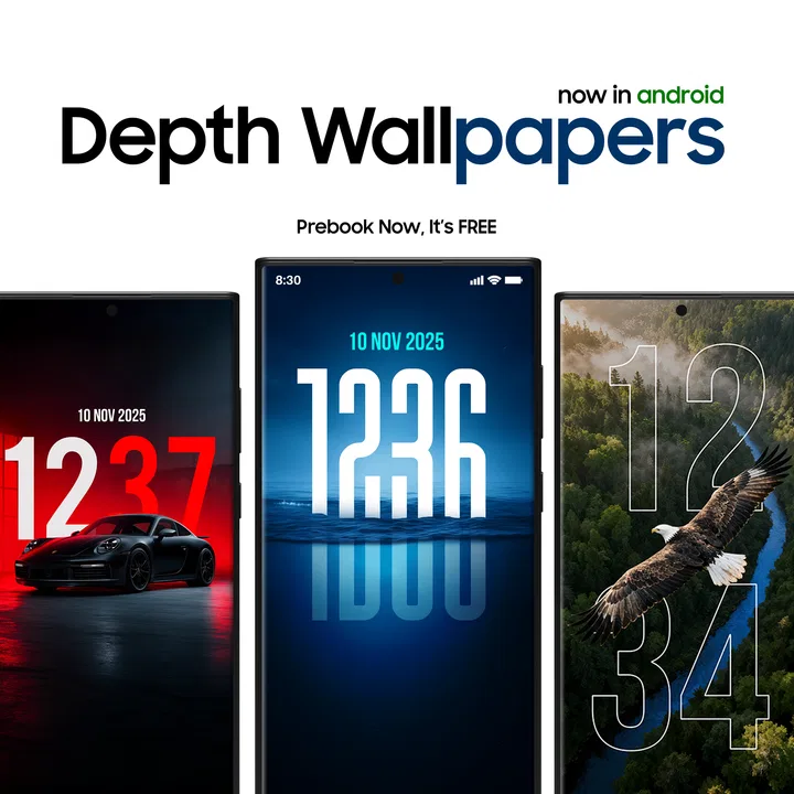
I approached Depth Wallpapers & Live Clock as a small personalization tool rather than a complete phone makeover. Its purpose is straightforward: give your Android screen a wallpaper with a clock and a layered visual effect that feels more considered than a standard static background. After spending time with it, I think its appeal comes from that focused idea. It does not try to replace your launcher, redesign every icon, or turn customization into a complicated project.
The app is free to install, with optional in-app purchases ranging from $0.49 to $7.99 per item. That makes it easy to try without committing money first. It is published by JustNewDesigns and sits in the personalization category, where it competes with enormous wallpaper libraries, live wallpaper engines, and phone-maker themes. Its store summary describes beautiful wallpapers with a live clock and depth effects, but the practical question is whether those elements remain useful and comfortable during everyday phone use. In my experience, the answer depends heavily on how much visual movement and decoration you actually want.
What the first screen tells you about the experience
The first thing to understand is that the clock and depth treatment are the reason to choose this app. If you only want a plain photograph behind your icons, a gallery image or a basic wallpaper picker will be simpler. Here, the attraction is the combination of background art, time information, and a sense of separation between parts of the image. That can make a familiar lock screen feel more personal without requiring a full theme.
You May Also Like

 Blood Strike: 2.5 Anniversary
Blood Strike’s Loadouts Turn Every Drop Into a Tactical Gamble
A close look at Blood Strike’s custom loadouts: how fast access to signature weapons reshapes its battle royale rhythm, rewards preparation, and narrows the gap between fights.

 Pandora - Music & Podcasts
Pandora’s Music Is Easy to Start, but Harder to Recover
Pandora’s strength is its low-effort path from a seed to a station. Its weak spot is how much confidence it asks you to place in connection, setup, and quiet recovery.

 8 Ball Pool
 Is Built on Rivalries, Rematches, and Routine
A close look at the rivalries, rematches, shared routines, and unanswered safety questions that turn a quick pool match into a persistent mobile community.

 Samsung Music
’s Quiet Strength Is Playing What You Already Own
Its reach comes less from spectacle than from dependable access to a personal library. That simplicity is both the app’s strongest retention engine and its ceiling.

 AccuWeather: Weather Radar
AccuWeather Review: A Quick, Clear Forecast for Everyday Decisions
For everyday plans, the best forecast is the one you can understand quickly. AccuWeather makes rain timing, radar, and local conditions easy to act on, with a few trade-offs.

 Hill Climb Racing
Why Hill Climb Racing Still Turns Crashes Into One More Run
A tiny car, a bumpy hill and one more upgrade: Hill Climb Racing keeps resurfacing because its simple chaos makes every near-miss feel personal.
More From Our News Desk



I would recommend it most to someone who checks the lock screen frequently and wants that glance to feel polished. It is also a sensible choice for people who enjoy changing their phone’s appearance but do not want to spend an evening arranging widgets and icon packs. The visual result can be expressive while keeping the customization task relatively narrow.
At the same time, a live clock is not automatically better than the clock already built into your phone. Some users prefer a completely clean screen, while others need a large, high-contrast time display. The depth effect can also make a wallpaper feel busier, especially when app icons or notification text sit over the same area. I would skip this app if your priority is maximum simplicity, battery-conscious minimalism, or complete control over every lock-screen element.
The app has reached a 4.8 average from around 9K ratings, and it has passed 1M+ installs. Those figures suggest that the concept has found a sizeable audience, but they should not replace a personal test. Wallpaper preferences are unusually subjective: a design that looks elegant on one display may feel crowded on another, and a clock style that works on a lock screen may be awkward behind a home-screen grid.
How I would prepare before choosing a design
Before opening the wallpaper selection, I would decide where the image needs to work. A lock screen usually has open space for the clock, while a home screen has to leave room for icons and widgets. This distinction matters more with layered artwork because the depth illusion can be weakened when important visual details are hidden behind shortcuts.
I would also check the phone’s existing clock placement and notification habits. If your device already places a large time display over the wallpaper, the app’s own clock may compete with it rather than improve it. The best result comes when the wallpaper and the phone’s interface have clearly separate jobs. Let the artwork create atmosphere, and let the system clock remain readable instead of stacking several competing time displays.
A useful first-time approach is to choose a design with a calm central area rather than the most dramatic image available. This is not because dramatic wallpapers are bad. It is because a quieter background makes it easier to judge whether the depth effect is helping, whether the time remains legible, and whether notifications still look comfortable. Once that baseline works, you can move toward more elaborate choices.
Setting it up without turning customization into a chore
My advice is to treat the first setup as a short experiment. Install the app, browse enough to understand its visual direction, and select one wallpaper that suits your lock screen first. Do not immediately try to perfect both the home screen and lock screen at once. A single successful result gives you a reference point for deciding whether the live clock and layered presentation fit your phone.
The current version is 1.4.01, and it supports Android 8.1 or later. That is useful for people using older Android hardware, although the final appearance will still depend on the phone’s display, system wallpaper behavior, and interface layout. Compatibility with the operating system does not mean every handset will position the clock or depth elements in exactly the same way.
When you reach the point where the app asks you to apply a design, pause and look at the available destination choices. Wallpaper tools often make it easy to apply an image broadly, but the right choice depends on how you use your phone. If your home screen is already carefully arranged, applying a busy design there may reduce readability even if it looks excellent on the lock screen. I would start with the lock screen, then consider the home screen only after checking the icon contrast.
One small but important habit is to view the result in ordinary lighting. A wallpaper that looks balanced in a bright room can become too dark or overly vivid at night. Likewise, the clock may appear clear in a preview but blend into the background when notifications arrive. I would check the actual lock screen several times during the day before deciding that a design is a keeper.
The first meaningful success: make the clock useful, not merely decorative
The first successful action is not simply applying a wallpaper. It is applying one that lets you read the time instantly while preserving enough empty space for notifications. That is the point at which the app starts earning a place on your phone.
To reach that result, I would compare the preview with the real lock screen and look at three things: whether the clock contrasts with the image, whether the layered subject is being covered by interface elements, and whether notification text remains easy to scan. If one of those fails, I would change the wallpaper before changing other phone settings. The problem is often the composition of the image rather than the app itself.
This workflow is especially helpful for people who use their lock screen as an information checkpoint. I often glance at the time, notifications, and next task without unlocking the phone. A good depth wallpaper should support that habit, not force me to stare at the screen to find the clock. In that sense, the most attractive design is not always the best design; the most successful one is the design that stays readable during quick, distracted glances.
There is also a practical trade-off between a live clock and a static wallpaper. The live element adds a sense of purpose because the screen feels current whenever you look at it. However, it also introduces another visual component that can become distracting if the wallpaper already contains strong shapes, bright highlights, or a prominent subject. I would use the live clock with a restrained image first, then decide whether a busier combination still feels comfortable.
A realistic daily scenario
Imagine checking your phone while leaving home. You want to see the time, scan a couple of notifications, and put the device away without unlocking it. With a suitable Depth Wallpapers & Live Clock design, the background can make that quick interaction feel more distinctive, while the clock provides an immediate anchor. Later, when you unlock the phone, the same image may still look good behind your icons, but only if its main details do not sit directly beneath your shortcuts.
That scenario shows why I would not judge the app from a preview alone. The design has to survive movement, changing light, notification banners, and the transition between lock screen and home screen. A wallpaper can be attractive as an isolated image and still be inconvenient as part of a working phone interface.
Where first-time users may become confused
The most likely confusion is assuming that the app controls every clock behavior on the phone. It is better to think of it as a visual wallpaper experience. Your device’s own lock-screen rules, clock placement, notification layout, and home-screen design still matter. If the result looks different from the preview, the system interface may be repositioning or covering parts of the composition.
Another possible misunderstanding concerns the word “depth.” I would not expect every wallpaper to create the same dramatic separation. The effect is tied to the artwork and to how the phone displays it. Some designs may feel strongly layered, while others may offer only a subtle sense of foreground and background. That variation is a strength when you want different moods, but it can disappoint anyone expecting one uniform visual effect across the entire collection.
It is also worth remembering that applying a wallpaper does not necessarily reorganize your icons or widgets. If you want a fully coordinated home screen, you may still need to adjust those elements separately using your phone’s existing tools. I prefer this limited scope because it keeps the app easy to understand, but users looking for a complete theme package may find the experience less comprehensive than a launcher or manufacturer theme system.
The purchase model deserves a quick, practical explanation. The app itself is free, while optional items may cost between $0.49 and $7.99. I would first establish that the free experience suits your screen and routine before buying anything. A paid design is only worthwhile if it solves a specific preference—better contrast, a more suitable mood, or a composition that works with your icons. Buying simply because an image looks impressive in a preview is an easy way to end up with a wallpaper you stop using after a day.
Because the content rating is Everyone, the app is positioned as suitable for a broad audience. That does not mean every visual style will suit every person. Parents, older users, and anyone with vision-related preferences should still prioritize clear clock contrast and uncluttered notification areas over visual novelty.
How it compares with ordinary wallpaper choices
A regular photo from your gallery gives you maximum personal meaning and usually the least setup. It may be the better choice if you want a family picture, a travel memory, or a very specific crop. The trade-off is that a personal photo was not necessarily composed to accommodate a clock and notification text. Depth Wallpapers & Live Clock is more useful when you want artwork designed around a screen experience rather than an image you already own.
Large wallpaper libraries offer more variety, but that variety can make choosing exhausting. You may spend more time scrolling than enjoying the result. This app’s focused identity is an advantage for someone who specifically wants a live time display and layered presentation. On the other hand, a broad library may be better if you want abstract patterns, sports imagery, illustrations, or seasonal changes that fall outside this app’s visual direction.
Launcher-based customization goes further by changing icons, grids, gestures, and widgets. I would choose a launcher when the goal is to redesign how the phone works, not just how it looks. This app makes more sense when you are happy with your current launcher and want a visual upgrade without learning a new navigation system.
Finally, a manufacturer’s built-in wallpaper features may integrate more tightly with the phone’s lock screen. They can be preferable when you need exact control over clock placement, always-on display behavior, or system-level themes. The advantage here is the distinctive combination of wallpaper and live clock in a dedicated personalization app, but the advantage of built-in tools is often smoother integration.
Who should use it and what I would do next
I think this app is a good fit for Android users who want their lock screen to feel designed rather than incidental. It is particularly appealing if you enjoy changing visual details, appreciate a clock that is part of the composition, and do not need a complete launcher replacement. The free starting point also makes the decision low-risk: you can judge the look on your own device before considering optional purchases.
I would be more cautious if you rely on a very clean home screen, dislike animated or changing elements, or need precise control over system clock behavior. People who want their own photographs to dominate the screen may also prefer the gallery. And if your main goal is matching icons, widgets, and gestures to one visual style, a launcher or a built-in theme tool will probably go further.
My recommended next step is simple: choose one restrained design, apply it to the lock screen, and use the phone normally for a day. Notice whether you read the clock faster, whether notifications remain clear, and whether the depth effect still feels pleasant after the novelty fades. Then test the same design behind your icons only if the home screen remains easy to use.
That trial gives you a better answer than browsing previews indefinitely. If the clock improves your quick checks and the layered artwork adds personality without getting in the way, the app has done exactly what it promises in practical terms. If you keep hiding the image behind widgets or switching back to a plain background, that is useful information too.
Overall, I see Depth Wallpapers & Live Clock as a focused personalization app with a clear visual purpose. It is not the right tool for rebuilding an entire Android interface, but it can make the lock screen feel more intentional with very little effort. I would recommend trying it first with a calm composition, judging the real-world readability, and spending on optional items only after one design proves that it belongs in your daily routine.
My main recommendation is to prioritize readability over the most dramatic depth effect. When the clock, notifications, and artwork share the screen comfortably, the app feels polished. When they compete, even a beautiful wallpaper becomes tiring. Used with that expectation, it offers an easy and enjoyable way to give an Android phone a more personal first impression.
FAQs for Depth Wallpapers & Live Clock
01What is Depth Wallpapers & Live Clock and how does it enhance my device's appearance?
Depth Wallpapers & Live Clock is an application that offers a wide range of high-quality, dynamic wallpapers along with a customizable live clock feature. It enhances your device's appearance by providing immersive 3D wallpapers that adapt to your phone's movements, creating a visually engaging home screen experience. The app's clock feature allows for personalization, adding both style and functionality.
02Does Depth Wallpapers & Live Clock significantly impact battery life?
While dynamic wallpapers and live clocks can use more battery than static images, Depth Wallpapers & Live Clock is optimized to minimize battery consumption. The app uses efficient algorithms to ensure that the 3D effects and animations are as power-efficient as possible, allowing you to enjoy the aesthetic benefits without a significant drain on your battery.
03Is Depth Wallpapers & Live Clock compatible with all Android and iOS devices?
Depth Wallpapers & Live Clock is designed to be compatible with most modern Android and iOS devices. However, for the best experience, it is recommended to use the app on devices that support advanced graphics and motion sensors. Always check the app’s requirements in the app store or on our website to ensure compatibility with your specific device.
04Can I customize the live clock feature in Depth Wallpapers & Live Clock?
Yes, the live clock feature in Depth Wallpapers & Live Clock is highly customizable. Users can adjust the style, color, and size of the clock to match their personal preference or theme of their home screen. This customization allows users to tailor the app to their unique taste while maintaining functionality and elegance.
05Is there a cost associated with downloading or using Depth Wallpapers & Live Clock?
Depth Wallpapers & Live Clock is free to download, offering a range of features at no cost. However, the app may offer in-app purchases or a premium version that unlocks additional wallpapers, clock styles, and features. Users can choose to stick with the free version or enhance their experience by investing in the premium offerings.
Pros
- High-quality
- vibrant wallpapers.
- Easy-to-navigate user interface.
- Customizable live clock options.
- Regular updates with new content.
- Low battery consumption.
Cons
- Limited free content availability.
- Contains in-app advertisements.
- Requires internet for some features.
- Occasional app crashes reported.
- Limited customer support response.

Depth Wallpapers & Live Clock
Gallery